Fragrance Buy
An online store with a range of premium perfumes
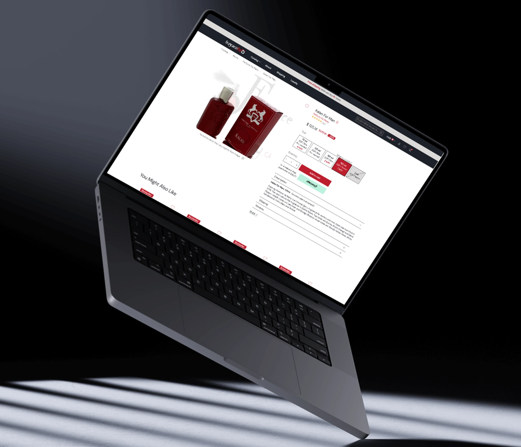
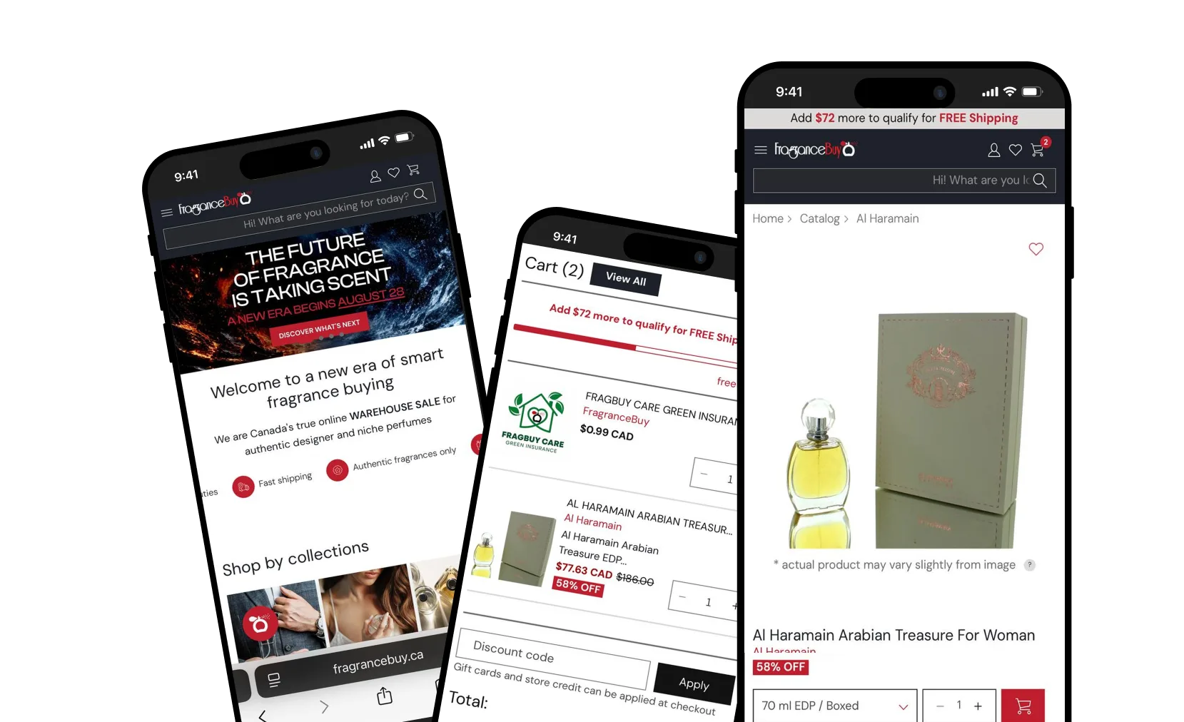
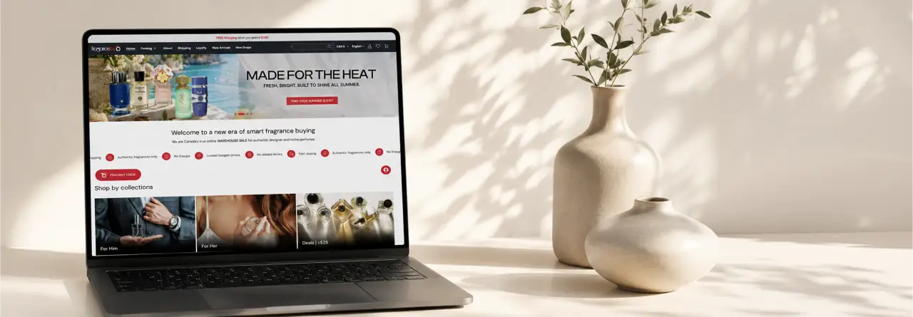
We completed a redesign of an online perfume store for a Canadian client, transforming it into a more modern and user-friendly platform. The new design prioritizes ease of navigation and enhances the overall shopping experience, making it more intuitive and visually appealing for customers. Our goal was to create a seamless and enjoyable online shopping environment tailored to the needs of the target audience.



Challenges We Faced
The main issues affecting the conversion rate of the website were the outdated design, which did not meet modern standards, and the lack of clear calls to action, making it difficult to motivate users to make a purchase. Additionally, the site contained too much unnecessary text, which overloaded visitors and distracted them from the key information. Visual clutter also created a sense of chaos and worsened the overall user experience. There is no clear association with a store specializing in premium-brand perfumes.
SOLUTION
Clear calls to action were developed and integrated, facilitating intuitive decision-making for users. The optimization of content structure eliminated excessive textual information, retaining only the most relevant data. Additionally, the visual composition of the website was revised by removing unnecessary elements that caused clutter and improving the placement logic of key sections.
As a result of these changes, the website became more efficient, providing users with convenient access to essential information and contributing to increased engagement metrics.

Colors
Typography
DM Sans

Colors
We used the brand's signature colors—red and black—since the client wanted them to form the foundation of the website’s color palette. The red buttons serve as eye-catching accents, while the black background is used in certain sections to create depth and contrast. We carefully balanced a clean, refined design with bold highlights to ensure the website feels dynamic yet not overly aggressive.

Site Structure
The website features intuitive navigation and a well-structured homepage, allowing users to quickly find sections, brands, or specific perfumes. Product cards include additional hover buttons for a more convenient shopping experience.
Another key aspect of our work was website personalization. Registered users benefit from a wishlist, personalized headings, loyalty program point accumulation, and more, creating a tailored and engaging experience.