ACE GIFTS
CANADA'S LEADING WHOLESALE & RETAIL
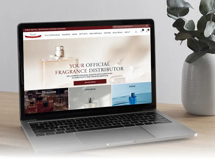
We redesigned the AceGifts Plus website to bring a fresh, modern, and user-friendly experience to their customers.
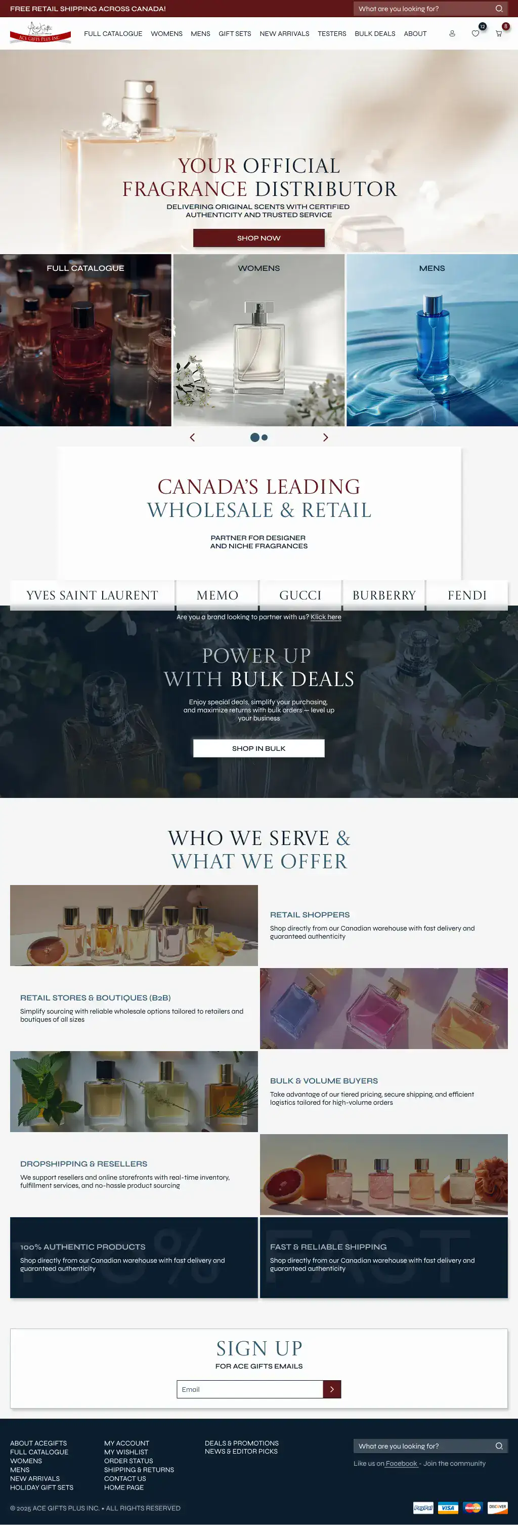
The new design replaces the outdated and visually heavy layout with a cleaner, more streamlined interface. By simplifying the structure, improving the visual hierarchy, and enhancing navigation, the updated website feels more intuitive and easier to browse. The refreshed look supports a smoother shopping experience, helping customers find and purchase products faster.



CHALLENGES WE FACED
The previous version of the website had several usability and visual issues that affected the overall shopping experience. The outdated design made the interface feel cluttered and inconsistent, reducing visual clarity and trust. The navigation menu took up too much screen space, making browsing difficult—especially on smaller devices. Product cards and product pages were not optimized for quick scanning, leading to confusion and lower engagement. Additionally, the wholesale page was poorly structured and hard to use, creating friction for B2B customers who needed a fast and efficient ordering process.
SOLUTION
The new layout brings visual hierarchy and consistency, improving clarity and making the site more enjoyable to browse. The navigation menu was fully restructured and minimized so it no longer obstructs the screen, allowing users to quickly access any section. Product cards and product pages were redesigned to highlight key information, improve readability, and streamline the decision-making process.
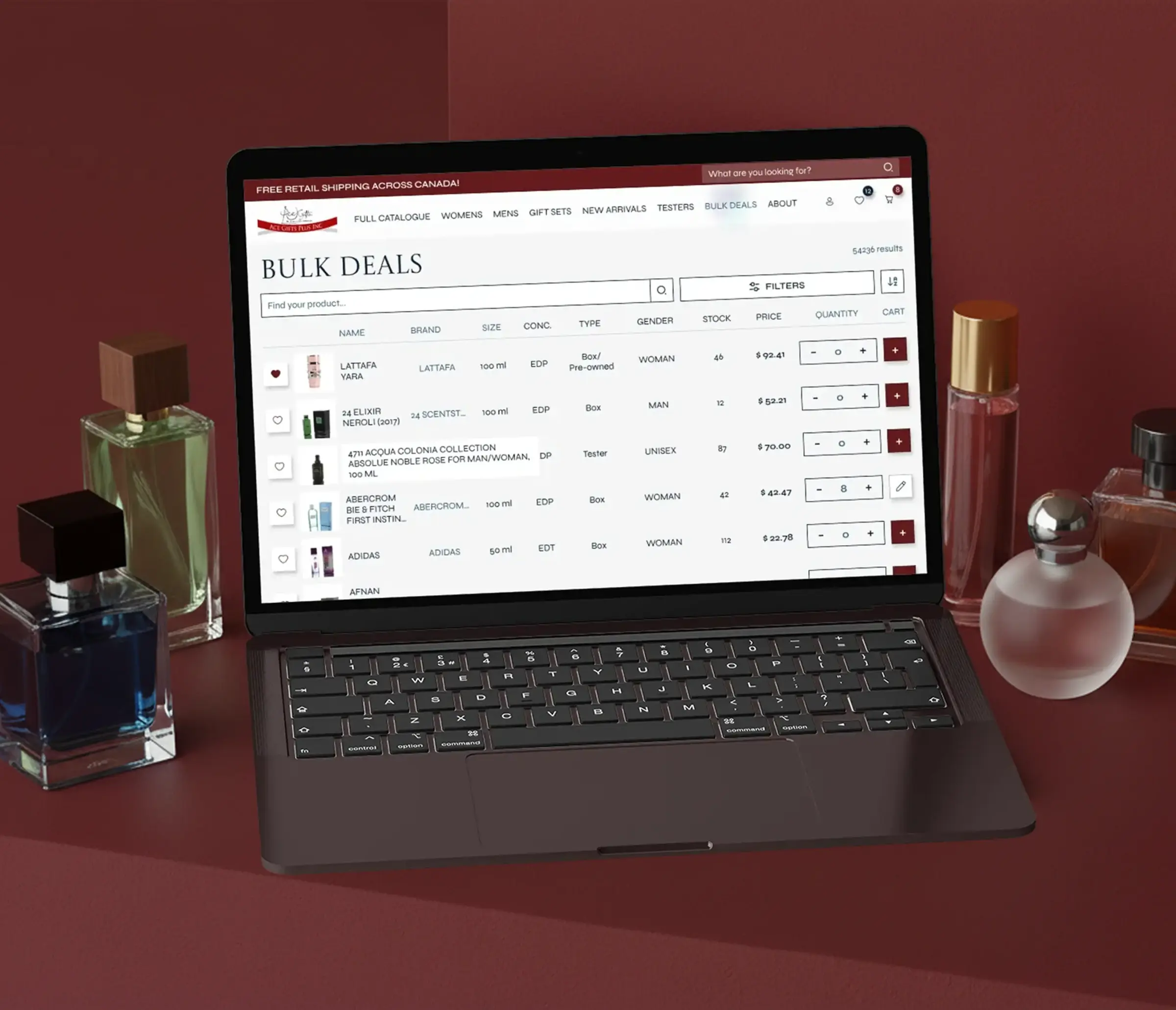
The wholesale page received a complete UX overhaul, making bulk ordering faster, more understandable, and more convenient for professional buyers.

Colors
Typography
Castoro Titling
Syne

Colors
We preserved the brand’s signature burgundy color to maintain familiarity, strengthen brand recognition, and ensure a smooth visual transition for returning customers. At the same time, we introduced a refined palette of blue accents to give the website a fresher and more modern appearance.
The addition of blue not only creates stronger contrast and improves overall readability, but also brings more visual diversity to the interface, making the updated design feel balanced, contemporary, and engaging.

Site Structure
We redesigned the site structure to clearly support both retail and wholesale shopping scenarios. Each user group now has a dedicated, intuitive flow tailored to their needs. For regular customers, the shopping experience is simple, streamlined, and focused on quick product discovery. For wholesale buyers, we created a separate, optimized pathway with easier navigation, faster access to bulk pricing, and a more efficient ordering process. As a result, the website now feels convenient and user-friendly for any type of purchase.
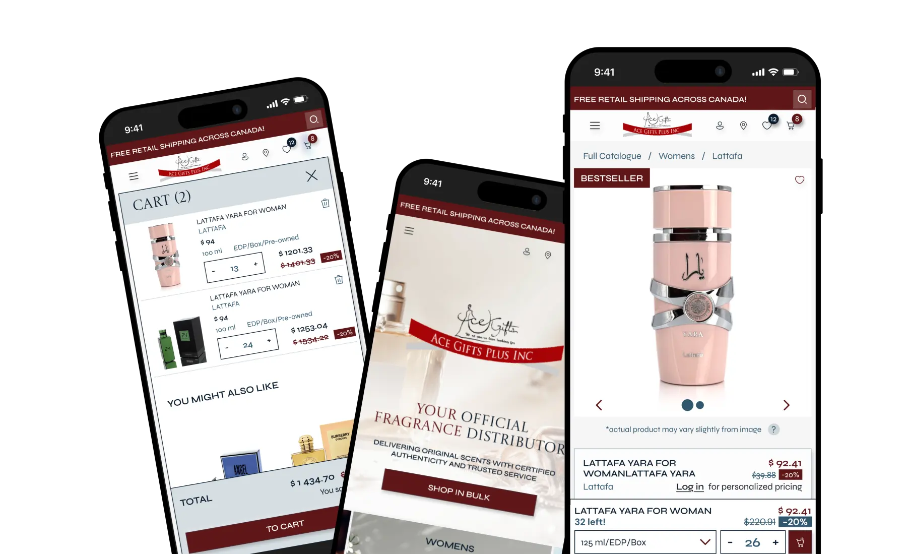


How Stackd Continuity helped with this Shopify store
- accessible larger orders with bulk purchasing
- customers save products they love, come back to them later via wishlist
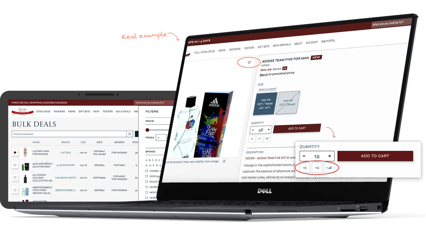
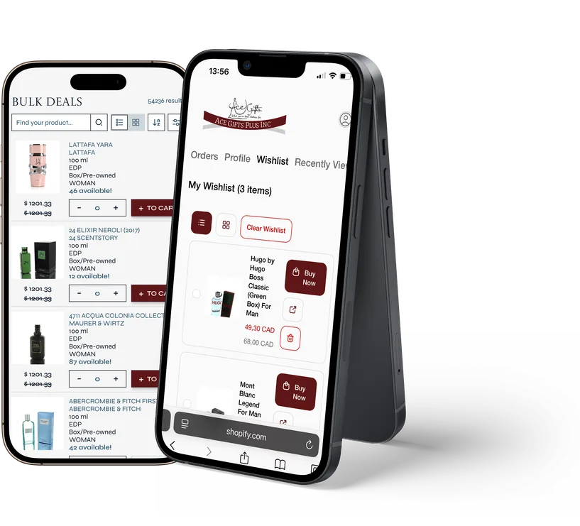
Bulk deals and wishlist
Thanks to the StackdContinuity app, the integration now includes a bulk purchasing feature that allows users to buy products in larger quantities—giving AceGifts a competitive edge. The integrated wishlist also lets customers save their favorite items, keep track of products they love, and easily share them with others for future purchases.